
Škoda Annual Report
Strategy
Design
Creative

Searching for another boring annual report? Ooops. Something went wrong!

The Solution
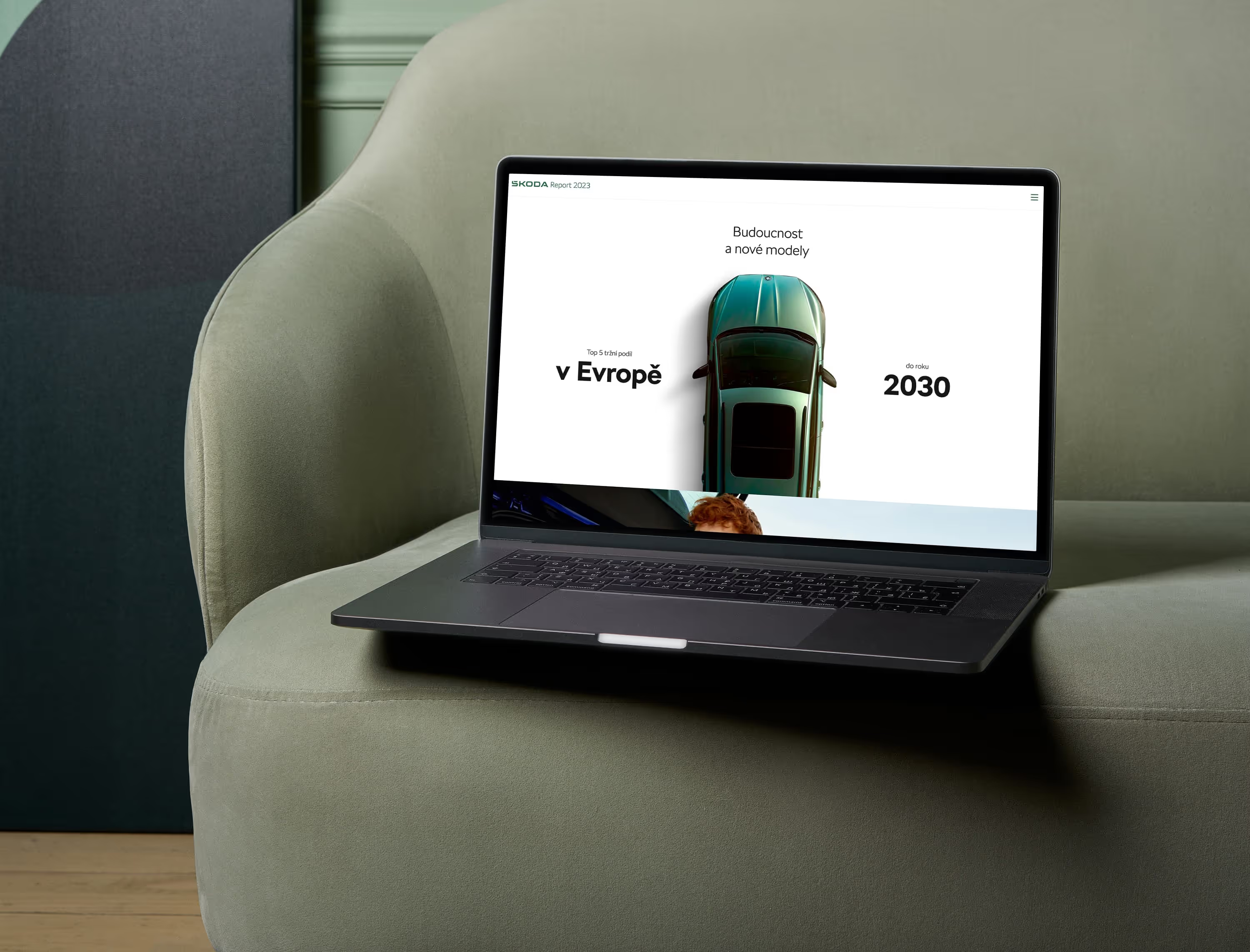
Reinventing a fairly old school, printed out and forgotten format of the annual report was a challenge that spoke to us. We created an enticing digital version and combined intuitive data visualization with minimalist design.
User experience was a great priority when making design choices. Allowing everybody to view the necessary information in the way that fit them the most. Letting readers display exactly what they wanted in all the graphs and info graphics. Something you just can’t do in print.


No items found.
The Result
No items found.
No items found.


